Feeds:
Posts
Comments

Archive for the ‘Design’ Category

5, 6, 7, 8

One of the more subtly iconic architectural features of India are the the stepwells. In a sometimes arid landscape, wells often needed to be deep and were significant elements of infrastructure, so it’s not a surprise that they became more and more elaborate.

Chicago journalist Victoria Lautman has spent much of the last five years criss-crossing India, photographing and visiting over 200 stepwell sites, and she’s now published photos of 75 of the more unique and interesting wells in her book, The Vanishing Stepwells of India.

Ramkund. Bhuj, Gujarat. Mid-18th Century (c. 700 CE). Mukundpura Baoli. Mukundpura, Haryana c. 1650. Ujala Baoli Mandu. Madhya Pradesh. Late 15th/early 16th century. Chand Baori. Abhaneri, Rajasthan. c. 800 ce/18th Century. Dada Harir Vav. Asarwa. c. 1499 Navghan Kuvo. Junagadh, Gujarat. 4th/6th/Mid-11th Century.

(via)

Read Full Post »

Exploded Chair by Joyce Lin:

(via)
Read Full Post »

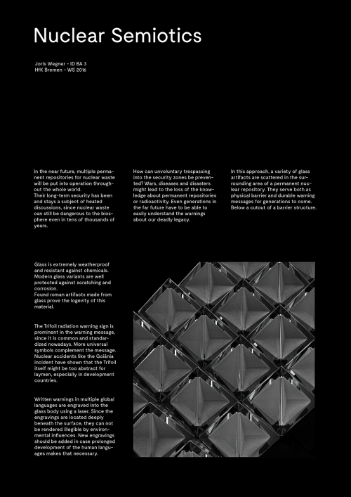
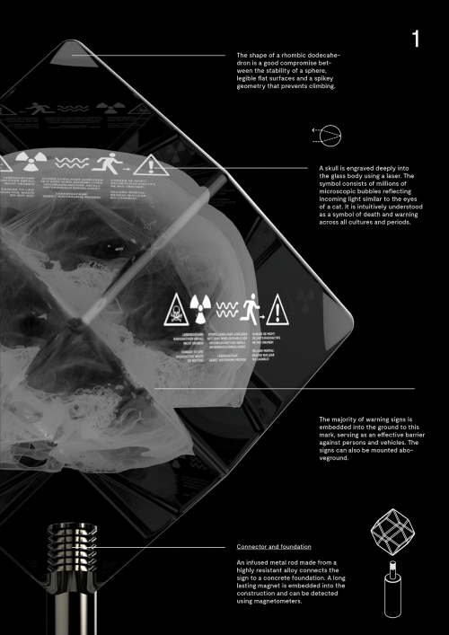
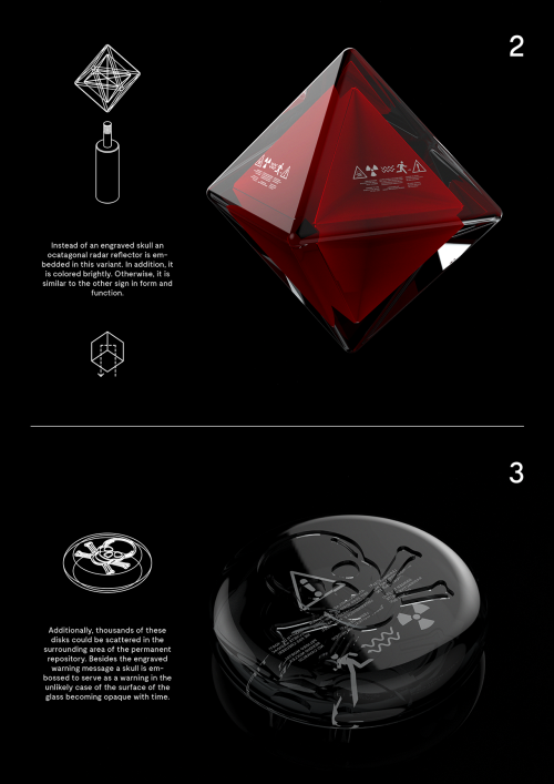
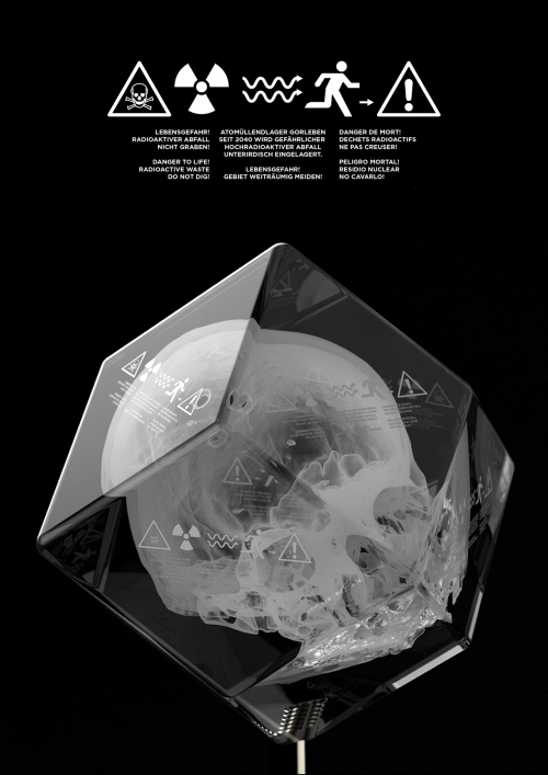
As part of a design project for The University of the Arts, Bremen, Joris Wenger has developed his own proposal for Nuclear Semiotics – (how we communicate the dangers of nuclear waste sites to future generations, which I covered in the last post.

I think the laser-etched skull is incredibly striking, and does a good job of conveying ‘death’. Though the trefoil nuclear sign and exclamation marks aren’t self-evidently about death, danger or nuclear radiation, so their meaning would quite easily be lost to time.

Having said that, when a subject is communicating across tens of thousands of years, it’s always going to be a difficult proposal, and easy to pick holes in. Joris’ work is beautifully finished and an interesting approach to a fascinating challenge:

tumblr_oh0p9dfsom1rk83z9o1_1280tumblr_oh0p9dfsom1rk83z9o4_1280tumblr_oh0p9dfsom1rk83z9o2_1280tumblr_oh0p9dfsom1rk83z9o3_1280tumblr_ogam1hsuse1rk83z9o1_500

(via)

Read Full Post »

Dead end

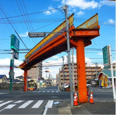
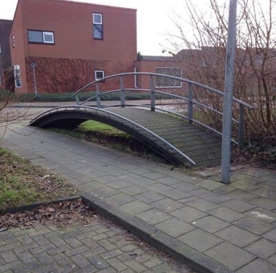
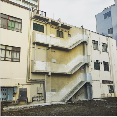
Steps that go nowhere, pedestrian walkways that dead-end into elevated bridges, doors that open out into mid-air; these structures are called ‘Thomassons’ and are what happens when workers demolishing or rebuilding an outdated structure leave part of it behind.

The term was coined by a Japanese artist, Akasegawa Genpei, based on Gary Thomasson. Thomasson was an American baseball player who was traded to Tokyo team the Yomiuri Giants, for a massive fee. for a two year contract. As soon as he hit Japanese soil though, he instantaneously became terrible, setting 1981s all-time strikeout record. However, due to being on a 2 year contract, the team had to keep him on.

For Akasegawa, Gary Thomasson was “useless” and also “maintained.”

The lovely thing about this story is not only finding out that a common urban phenomenon has a name, but also that this name has such an evocative genesis:

thomasson-10 screen-shot-2017-02-13-at-14-05-17screen-shot-2017-02-13-at-14-04-30 thomasson-5-644x636 screen-shot-2017-02-13-at-14-04-59 thomasson-2-960x720


Read Full Post »

Inter-space

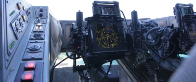
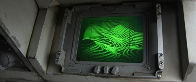
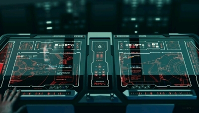
As a follow-on from the post on the designs on Iron Man’s User Interface (UI), here’s some spaceship UI from Rogue One and The Force Awakens.

Nice contrast between the industrial, cobbled-together look of the Rebel ships and the sleek, sophistication of the Empire’s console:

1 2 tumblr_o19pw7rxbv1s12c3do1_540

(via and via)

Read Full Post »

Visual design in games normally means either character or environment design, but it’s not often that it means branding.

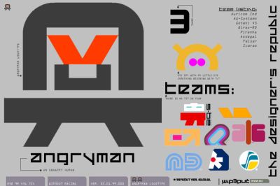
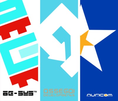
Appropriately, given how much of a role advertising and branding plays in modern Formula 1, futuristic PS1 racing game Wipeout was the first game to work with a design studio to develop the posters, logos and team icons seen throughout the game, (as well as the packaging and posters for the game).

The design studio, The Designer’s Republic was primarily known for working on album designs for Warp Records, the label that included Aphex Twin and The Orb. With their work on Wipeout, they brought music industry sophistication and cool to an industry that had previously favoured cartoony pop or teenage grittiness.

Sci-fi imagery often ages badly, but Wipeout’s still looks clean, iconic and real because the J-Pop, sci-fi corporate branding that The Designer’s Republic created feels like it was developed for real racing teams, rather than trying to create something that just looked ‘futuristic’.

More than 20 years later, it still looks great:


18j0zbltv2f2cjpg fklkbsxcwgdp3mjjij1p d4pcsqnrmaua0s77qvjf tsnaqrmhdyfibnbibsqbtumblr_nd59msv2jk1s7c5l3o1_540

(via)

Read Full Post »

Shatter

tumblr_nybuanzchb1s2gvcio1_1280

(via)

Read Full Post »

tumblr_oihuc3xexy1qz6f9yo1_1280tumblr_oihuc3xexy1qz6f9yo6_1280 tumblr_oihuc3xexy1qz6f9yo4_1280tumblr_oihuc3xexy1qz6f9yo3_1280tumblr_oihuc3xexy1qz6f9yo5_1280

(via)

Read Full Post »

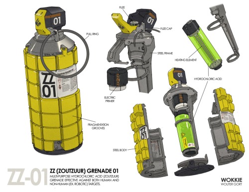
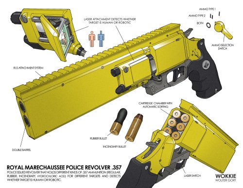
Wouter Gort is a Dutch concept designer. His Neo-Amsterdam designs feature realistic sci-fi designs for lawlessness and ultra-violence in a cyberpunk future (basically a mash-up of all my favourite things).

Featured below are the robot rudeboys who are the actual cyber punks of the Venice of The North, and the weaponry the police use to ‘subdue’ them:


wouter-gort-6-colour-ighting-11-final-small tumblr_o9yn5fwywf1sxm4gzo4_1280 wouter-gort-revolver-3-fill-in

(via)

Read Full Post »

Brutal legend

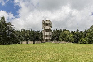
Under Tito’s rule (I think), Yugoslavia got seriously into concrete brutalist architecture. There’s some stark, sci-fi beauty going on there:

tumblr_oeuc3spuvi1qz6f9yo1_540 tumblr_oeuc3spuvi1qz6f9yo6_540 tumblr_oeuc3spuvi1qz6f9yo3_540 tumblr_oeuc3spuvi1qz6f9yo2_540 tumblr_oeuc3spuvi1qz6f9yo7_540

(via)

Read Full Post »

Older Posts »